
Dining Room Reveal: European Charm Meets Simplicity
Two months ago, I started the renovation of my former shop studio into a beautiful dining room for our family to enjoy. My husband recently switched to dayshift for the first time in his career (and our marriage), and we’re so excited to finally get to regularly eat dinner together around the table now as a family.

**This post contains affiliate links that help me support my family while bringing you beautiful, inspiring content. The full source list is at the bottom of this post.
If you’ve been around for awhile, you’re familiar with my old shop product photos having a white shiplap backdrop. To be honest, it worked for the photos but for my personal home style, it was DIY regret. It was much too busy for my taste and it took a ton of blood, sweat, and a few tears to repair these walls back to their former glory.

Design Plan
I knew I wanted this room to be light and airy and simple after the overwhelming busy-ness of the shiplap. So I got to work planning.
I always start with a room design board when I’m renovating a room. It helps me make confident decisions about what design elements I’m picking and keeps me on track for actually finishing the room (you 95%ers relate). I pick one or two anchor items for the room that are large and I KNOW I want and then I build the rest of the design around it. In this case, I started with the table and a large area rug as my anchor items. The details often change a little as I work through the makeover process (and in this case it did), but it gives me a wonderful framework to work off of.

It’s taken me almost four years to find my design style. It’s a little unique and I don’t even know what to call it – it’s minimal but full of a few gorgeous details that pack a punch. I love neutrals with a pop of color to give it a “wow” factor and then incorporate little unique details that draw it all together. I invest in a few statement pieces that MAKE the room and then thrift or DIY a few parts of it to help with cost but honestly……mostly because I can’t find exactly what I want and end up loving the process of bringing what’s in my head to life.
The Showstopper

I feel like this goes without saying, but the major showstopper in this room is the rug. It’s absolutely breathtaking and my favorite part of the room with all its variation throughout the design. When I initially made my design board, I almost went with a “safer”, more traditional rug and I’m so thankful I didn’t.

Not only does it make the room so different and unique, but it also holds a special place in my heart – the rug design is Turkish and one of my favorite trips of my life was to Turkey in 2009. Turkey is a melting pot of cultures and experiences, with its capital Istanbul split over two continents and its landscape ranging from old world charm and intricate textures in the cities to awe-inspiring mountain ranges and serene beaches in the countryside.
**These are actual photos from my trip in 2009.**
 It might seem like I’m digressing sharing those photos, but I’m really not! The entire design of this room played off my experience in Turkey after choosing this rug. From the warm rich color of the table and roman shades, to the subtle old world charm detail in the shelves and eucalyptus tree pot, to the bold but beautiful design of the rug, to the serene simple art on the wall – all of it perfectly reflects the deep appreciation my trip to Turkey gave me for mixing textures, warm and cool tones, and simplicity mixed with bold design pieces.

So secret time: I’ll only buy my rugs from one place – Well Woven. Last year, I bought my first rug from them for our living room and somehow it is still thriving despite having two large dogs and a baby.
In my experience, that’s an actual miracle so I specifically chose to shop from them for this room makeover. This new rug has been in my home for over a month and is still as brand new as the day I received it. It doesn’t shed, small spills and dirt come out of it easily with our small household carpet cleaner, and I’ve vacuumed it daily with zero signs of wear on the rug. Well Woven’s prices are also incredibly affordable compared to many other popular rug companies, and I’ve found that their signature rug designs are so unique you won’t find anything else even slightly similar when you’re shopping around.

Let’s Talk About all the Design Details
I knew I wanted to keep the overall design minimal and simplistic with such a bold rug, but I also wanted all those details to be beautiful. I painted the walls, ceiling, and trim Simply White by Benjamin Moore. It’s a warm white that feels like true white but with a slight touch of warmth that keeps the room from feeling stark.

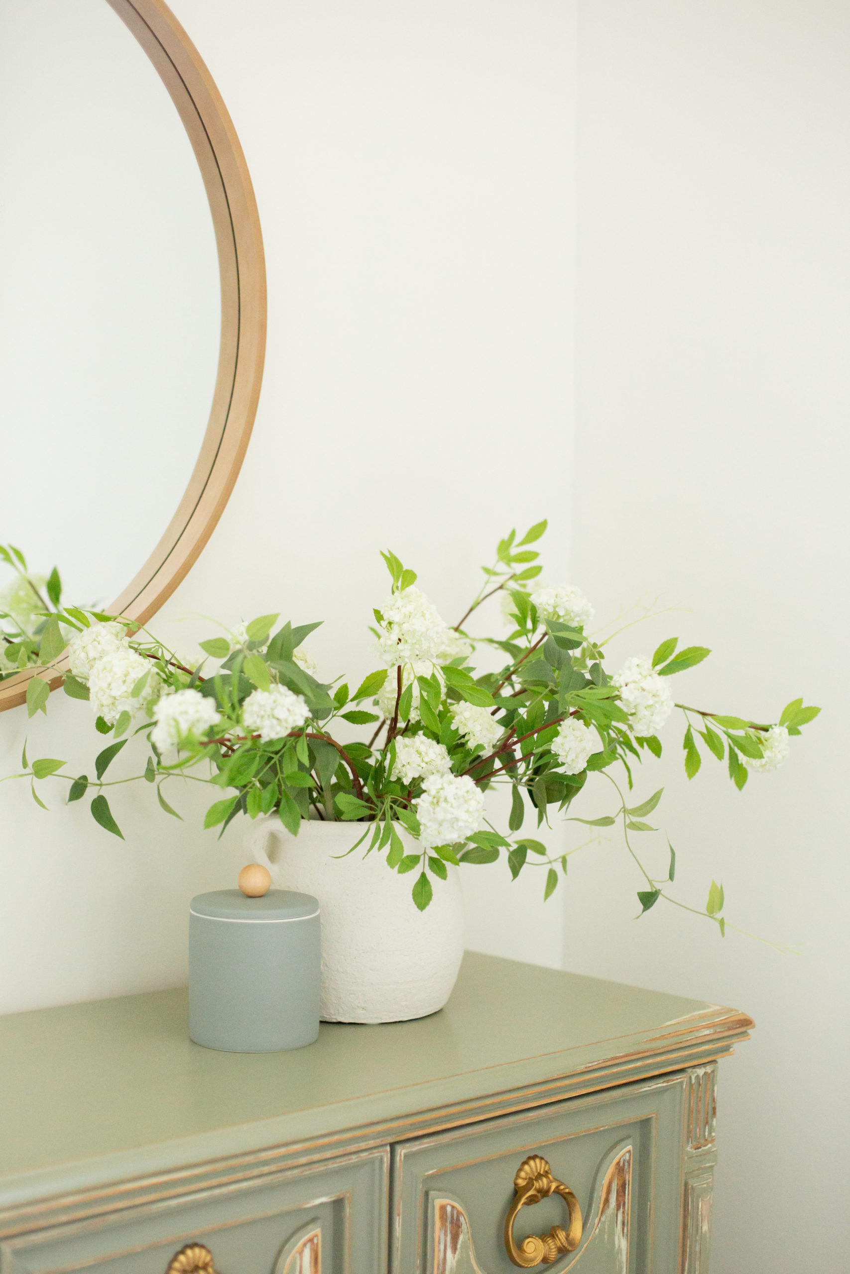
It wouldn’t be a Rosewood Home reveal if I didn’t showcase some type of florals. These are some of my favorite current faux floral stems from Afloral and they’re linked at the bottom of this post.
I thrifted the chairs from Facebook Market place and painted them Sherwin Williams Iron Ore Black (it’s soft black that errors on the side of charcoal more than solid black) using their Emerald Eurathane line that is self leveling and known for its hard shell and durability.

Surprisingly, I found our beautiful table through Home Depot! A friend of mine had mentioned that they have amazing online options for furniture and the prices are very fair. I had been looking for a table for over two weeks with no luck and immediately found a table I fell in love with a price far under what I had seen everywhere else for the same size and quality.

I found the shelves from Magnolia and they are super affordable! The shelves are styled with a tiny faux plant from Target’s Hearth and Hand line, a tiny bowl from World Market, the Magnolia Story book (paper sleeve pulled off), a journal I purchased while in Turkey, and my husband’s treasured bible from his grandfather.

The curtains and roman shades are from Amazon, and they are wonderful quality and well below the price point you’ll find anywhere else. The weeping eucalyptus tree is from Target’s line with Studio McGee – it was an investment piece but worth it in my opinion!

Lastly, I made the large wall art completely on my own and I’ll be doing a tutorial blog post in the very near future for how I created it. The quote on the signs reads: “This is the beginning of a new day. You have been given this day to use as you will. You can waste it or use it for good. What you do today is important because you exchanging a day of your life for it. When tomorrow comes, this day will be gone forever. In its place is something you have left behind. Let it be something good.”
I like the details in my home to be meaningful and I’m obsessed with every single detail in this room. My hope is that this inspires you to create rooms in your home that are true reflections of you, your design style, and the feeling you want your family to feel when they walk inside a room. It took me nearly two months to complete this room but it was time well spent – perfection can’t be rushed.
Room Sources
You may also like
Some sort of short description for the category will go right here.
Some sort of short description for the category will go right here.
Some sort of short description for the category will go right here.
Some sort of short description for the category will go right here.
Some sort of short description for the category will go right here.
What you’ll find around here
Shop My Favorites
I’m baby semiotics paleo VHS fixie fashion axe ramps tote bag church-key, bodega boys mixtape wolf af pug jawn stumptown. Locavore PBR&B ugh live-edge, small batch kitsch four dollar toast.
Angela's Picks
A downloadable paint guide to help you choose just the right shade for your next project.


This is gorgeous, and so
Practical! 💙 the colors complete the room!
Thank you Bailey!